Friday, June 17, 2011
Final!
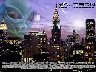
For my final, i took my alien fantasy poster I made earlier in the year. I added a title and small white text at the bottom to make it a movie poster. I also burned the bottom so you can see the white text easier. I downloaded the font for the title from dafont.com
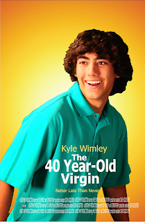
Movie Poster 2!
This is my second movie poster starring Kyle Wimley. It is a spoof of the 40 year-old virgin movie poster, I made it from scratch. I made the background with a simple radial gradient. then took the photo of Kyle and added him in then found the right font size, color and font and added it all in. Then I added the small white text at the bottom and Im done!
Wednesday, June 15, 2011
Movie Poster
For this project i chose to make my friend famous and put him in a movie poster. I took a picture of a road, a picture of a wintery town, a city and put them all together to make the background. I added a morristown sign and then took a picture of him and put him in. I added the text last and put it all together. It took me a very long time and I am very proud of my work.
Monday, May 9, 2011
Poster2
Here is the original photo I used.
and below is my final poster.
Tuesday, April 12, 2011
Fantasy Scene
Final Project:
Process: I call this one "The Overseeer". I took a picture of the New York City skyline and i added some planets and an alien overseer in the background. While this task may seem simple, 'twas not. I got the alien from a different picture and used a planet brush I downloaded from DevineArt. I am so very proud of myself and it came out so good!
Tutorial: Here is the tutorial I used to create my project. This is the original project I made to figure out all the different planet brushes and how to put them together well.
Images Used: Here are the pictures I used. I used the alien head from the photo above and the picture below.

Tuesday, March 29, 2011
Friday, March 11, 2011
Movie!
Here is my color theory movie i have been working on recently. I worked so hard on it and hope you learn something and enjoy!
Monday, February 14, 2011
Logos!
I came up with this concept when we first started our logos in December. I originally had a smile not a snorkel but i decided to put the snorkel to make it a bit more original, this way people will remember the name.
This logo took a very long time to perfect. When I first made it i knew i wanted to connect the "C" and the "P" but did not know how to go about it. I am very excited it came out so well and this may be my favorite logo.
This logo is more representative of my spirit rather than my actual being. Although my hair is short and I rarely wear a beanie, my soul does. Because my soul is very laid back and loves to just "roll with the punches," if you will.
Subscribe to:
Comments (Atom)


